![]()
So far the discussion of how depth is represented in paintings and drawings has emphasized a single tradition of art: the western tradition. By that I mean the tradition that arose in western Europe and was the major influence on art in the United States. However, other traditions of art arose and the choices of how to use the depth cues that have been discussion to convey the impression of depth have been quite different. Up front I want to state that while we may perceive these pieces of art as less realistic, at least part of the this feeling of a lack of realism comes from our cultural experience. Certainly as I have viewed the art more, I have found the impression of depth to become more pronounces as I become more sensitive to their use of depth cues.
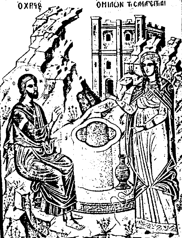
| One of the traditions that will be explored is that of Icon painting in the Christian Orthodox Church. In this tradition, individual style in painting was sacrificed for certain conventions meant to convey religious truths. In this tradition, it appears that in the conflict between interposition and relative height as depth cues, these artists chose to emphasize interposition. What I mean by a conflict between interposition and relative height is as you draw a figure higher in the painting there is less overlap between figures (The different relative size of objects takes care of that problem to some extent in the Western tradition). In Icons there is a tendency to paint objects all at the same level and use overlap to indicate depth. Take the figure at the top of the page which is a line drawing that is representative of many icons. Notice both the foreground figures and the background building. They both seem to rise from the same level (even though you cannot see the bottom of the building). Examine too the figures in the icon below. There is very little depth being represented and the depth is primarily indicated by interposition. |
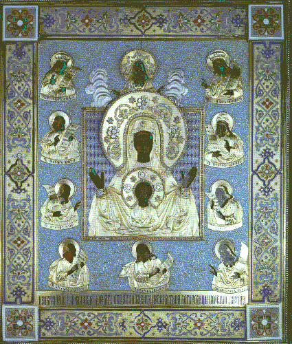 The Kursk Icon of the Mother of God
|
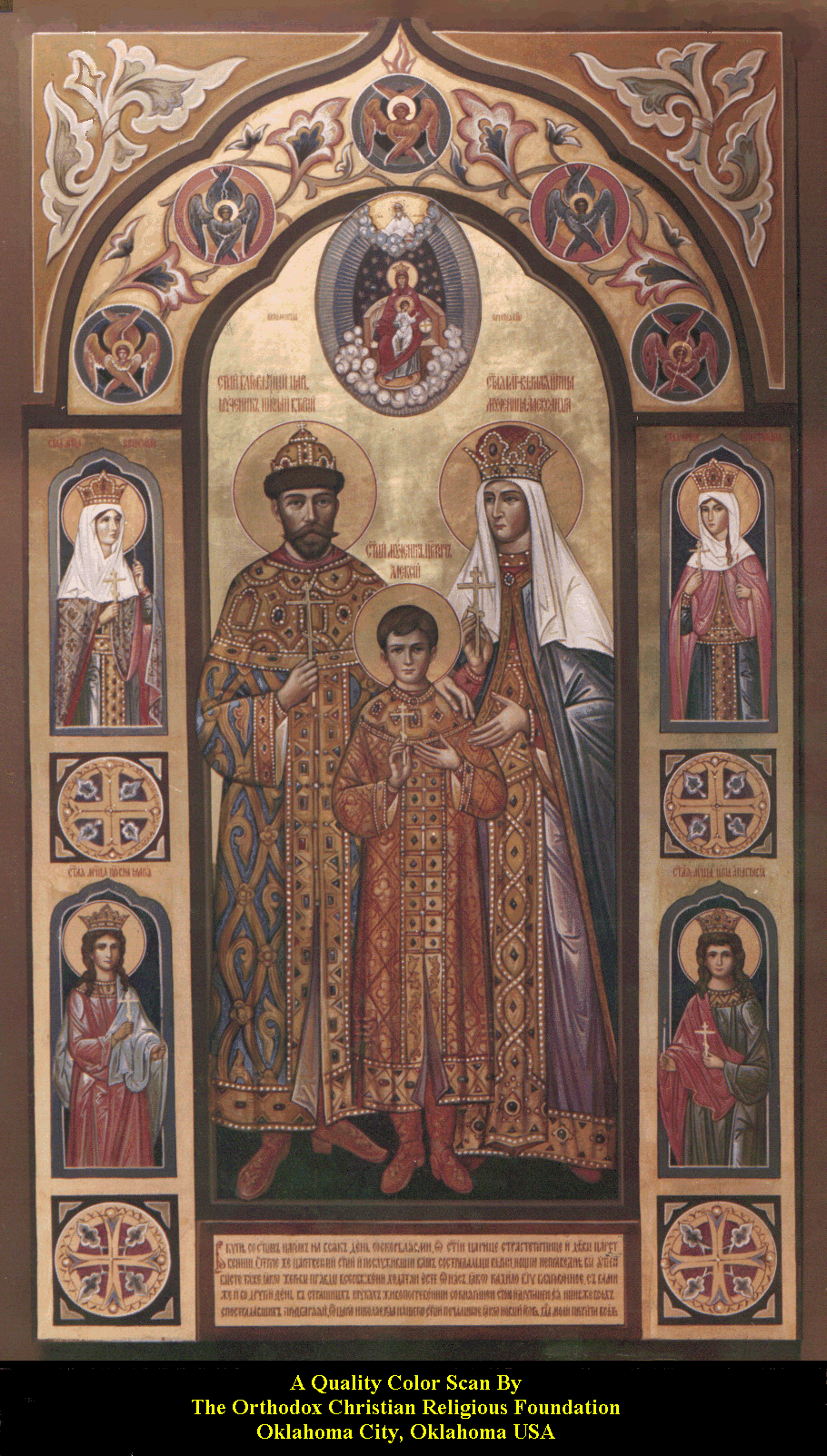 Romanov Royal Family, martyred by Bolsheviks, glorified by Russian Orthodox Church.. |
Unlike the painting used to illustrate interposition
before, The Madonna of the Magnificat, there is little
use of shadowing to give the figures a more three-dimensional feel, at least
to western eyes. This trend is also seen in more recent icons such as this icon
of the Romonovs who were killed in the Russian Revolution. This is a 20th century
icon and used more shadowing but the use is still limited.
The use of relative size is also not present as a depth cue. Look at the representation of the mountain versus the building in the drawing at the top of the page. The mountain is no bigger yet mountains are usually bigger than buildings. The use of size in icons has other, theological, uses than representing depth. |
![]()
![]()
![]()